Nintendo Switch Game Case Design
Role
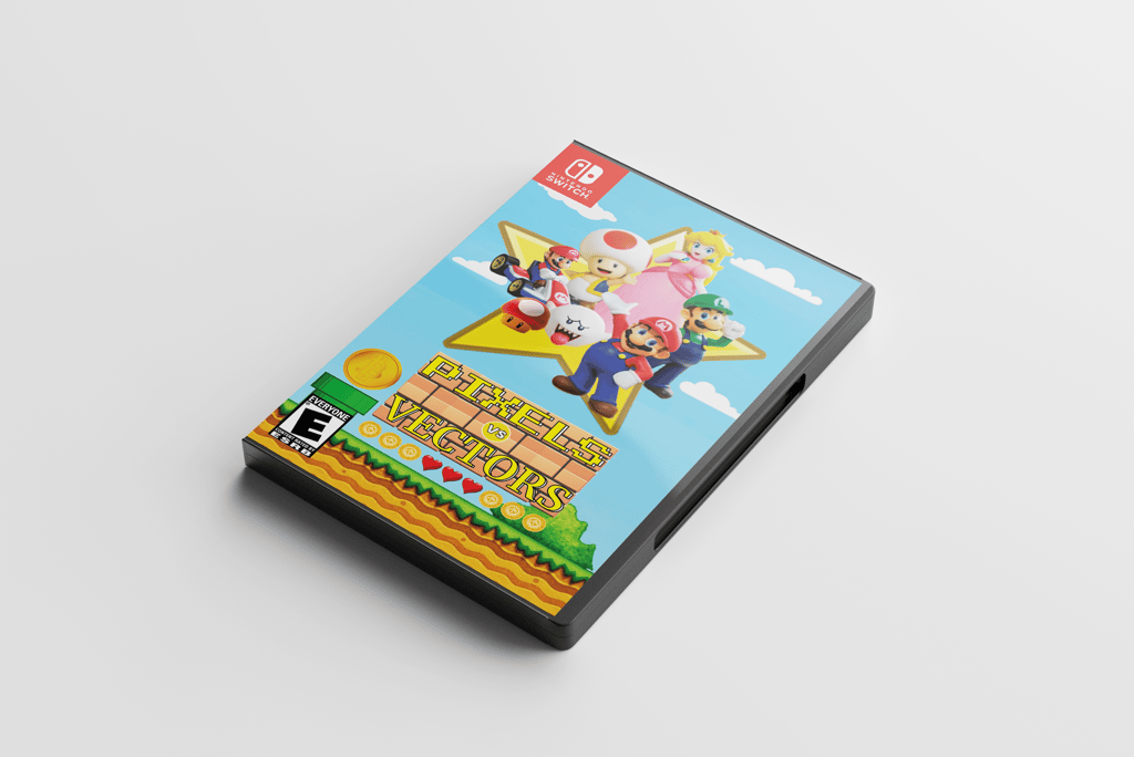
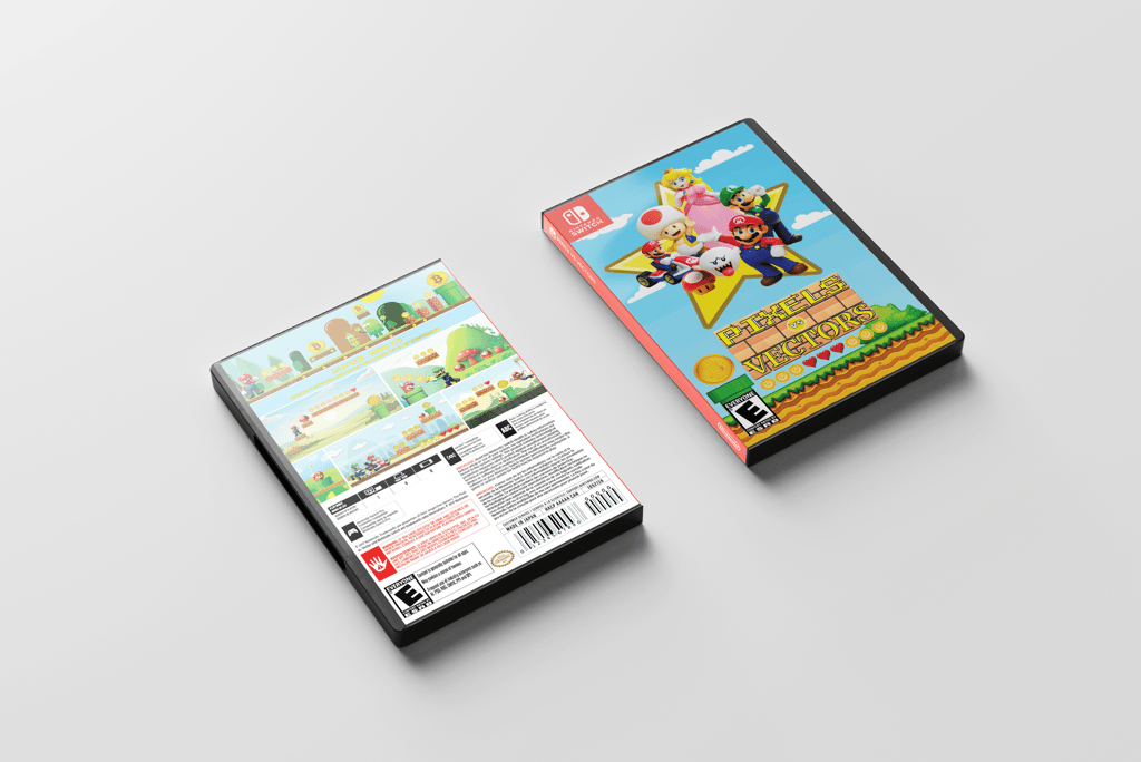
This project involved designing a Nintendo Switch game case cover for Pixels versus Vectors, including the front cover, spine, and back cover.
Graphic Designer
Software
Adobe Illustrator, Adobe Photoshop
The goal was to highlight the contrast between pixel and vector art styles while following the provided guidelines.
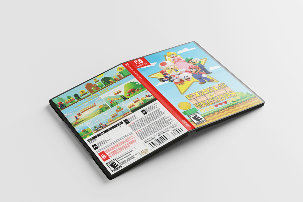
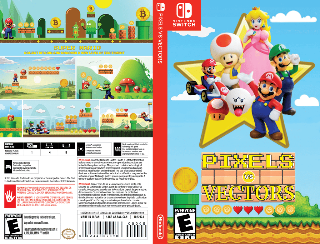
As the graphic designer, I was responsible for the overall design of the game box art design cover, including creating and arranging the layout in Adobe Illustrator, applying the correct color modes, using the specified fonts, and incorporating raster images created in Adobe Photoshop. I also sourced the appropriate stock images and ensured the consistency and alignment of all design elements.
Design Process
Research and Concept Development
I started by reviewing the provided assets and the game concept to understand the theme and visual style of Pixels vs Vectors. This informed my design choices, such as the pixel and vector contrast and the aesthetic of the Nintendo Switch platform.
Photoshop Image Creation
I sourced high-quality, copyright-free images from stock photography websites (Pixabay and Unsplash) that aligned with the game's theme. I created a composition for the front cover and selected six images to support the back cover. I adjusted these images in Photoshop to fit the required dimensions.
Illustrator Layout
Using Adobe Illustrator, I followed the specified dimensions and created a main layer with sublayers for the front cover, spine, and back cover. I used the provided switch cover template to guide the placement of elements.
Typography
I applied the specified fonts Press Start 2P for the word Pixels and Merriweather for the word Vectors, ensuring they were scaled appropriately and did not appear stretched or compressed.
Final Adjustments
After arranging all elements, I ensured the design adhered to the game’s branding and visual identity. I used the Adobe Illustrator package feature to save the file with all external assets and made sure everything was properly linked and organized. This approach ensured that the final product was visually appealing, well-organized, and met all the technical specifications.